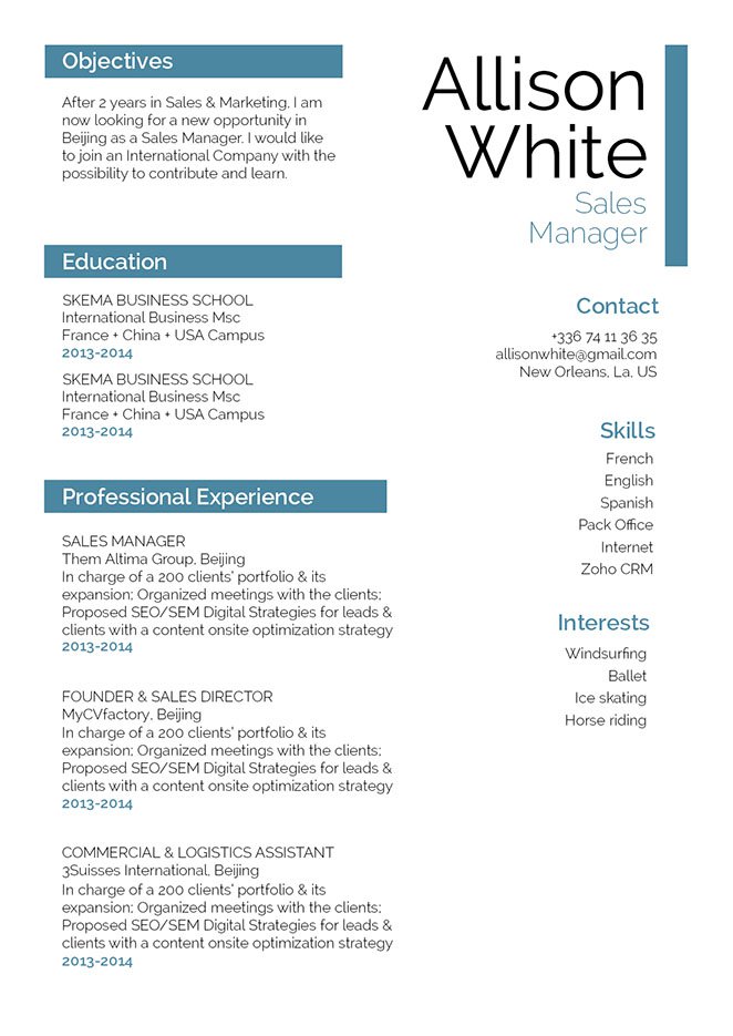
One major factor that makes a resume good or even perfect, is a clear and comprehensive design. If it's designed poorly, content won't be understood easily and the likelihood of your reader losing interest will increase.
No matter how well written that resume of yours is—it won't get a full reading the first time through! Therefore, you must present all its content in a well-organized structure. To achieve this, use a standard, but professional font like Helvetica or Calibri. Choose a font style between 11 and 12 to lessen clutter, and selectively apply bold and/or italic font styles to guide the reader's eyes. Make good use of symbols and graphics to bring attention to the key parts of your CV. And lastly, give your resume a logical format by using headings, subheadings, and white spacing.


